Welcome to a new era of Wendy (not the American fast food chain, the Wu Tours travel company), an era of new identities, a new sense of adventure as well as exciting and modern styles.
The Asia specialist this week relaunched its brand and logo to reflect the company’s ethos as a travel pioneer.
At first glance, the logo may seem the same, but take a second look and you’ll see it’s subtly different.
First, the colour of the ‘W’ is a couple of shades lighter from the former deep red. Wendy Wu Tours says this coral colour better reflects the core brand pillars of expertise, value, service and reputation.

The font on the logo has also been modernising, while still reflecting the maturity and expertise of the brand.
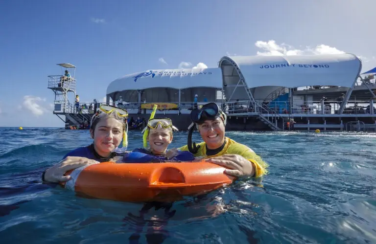
Plus, there’s an expanded new palette modernises the colours that denote each region, and aspirational imagery – including specific views of flora, fauna and culture – will now feature on all materials.

The Discovery Tours range remains branded in an ochre colour, reflecting its unique personality of adventure and excitement, while the Deluxe Collection moves to a silver, to reflect the luxurious nature of the product.
“Wendy Wu Tours as a company prides itself in a culture of continual improvement. Our relaunched visual identity and logo reflects our position as a dynamic innovator in the travel sector.”
Andrew Mulholland, Wendy Wu Tours Managing Director for Australia & New Zealand
The refresh brand compliments the operator’s recently relaunched consumer website, which moved to white space, reflecting the modern style of touring that the company offers. All digital communications will evolve to state-of-the-art styling, that has been tested for it’s UX appropriate design. Social channels have also evolved to the new styling.
Guests and travel agents will also note changes in the company’s brochures and other marketing materials, including the recently launched Early Bird Specials brochure. Following this transition, the full 2018 brochure range will launch with a new look and feel.