

Qantas last week revealed an update to its iconic Kangaroo logo as part of preparation for the Boeing 787 Dreamliner entering its fleet a year from now.
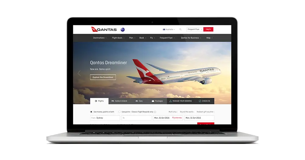
And already the new Qantas logo is live and in operation at qantas.com.au and across its other Social media channels.
The logo change is actually only the fifth time the red-and-white image on the tail of Qantas aircraft has been updated since it was first introduced in 1944. The last update was in 2007 to coincide with the introduction of the Airbus A380 to the national carrier’s fleet.

Facebook has a new icon
“Since the image of a kangaroo first appeared on a Qantas aircraft more than 80 years ago, it’s come to represent the spirit of Australia. When passengers see the Qantas tail at airports around the world, it’s a symbol of home,” said Mr Joyce (CEO Qantas Group)
And Joyce is not wrong with the red Kangaroo being arguably one of the most iconic and most recognisable of all aircraft tails at any airport.

Twitter gets a Qantas makeover
“When we looked at the history, we found that the logo has been updated around the time of a game-changing new aircraft joining the fleet. It’s a tradition that goes back to the Lockheed Constellation in 1947, the B747-300 in 1984 and the A380 in 2007. A fresh brand helps symbolise the new era Qantas is entering as we head towards our centenary. It’s an era of new destinations, new technology and a new standard of service”.
Alan Joyce (CEO Qantas Group)
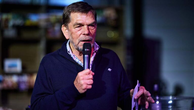
The new design was overseen by Qantas consultant designer, Marc Newson who has helped design Qantas’ lounges, the A380 cabin and the iconic Skybed, in partnership with Australian design agency Houston Group.

And Instagram has a new roo
“This re-design aims to retain the fundamental essence of the flying kangaroo but also move the brand forward. This new brand is more streamlined and the shading behind the kangaroo gives a better sense of movement and depth. A silver band now extends from the tail to the rear of the fuselage, to give a more premium feel”.
“The typography for the word Qantas, which measures almost two metres high on the 787, has been carefully streamlined. And Qantas will appear on the aircraft’s belly, so you can tell when it’s the national carrier flying overhead,” Mr Newson added.
![]()
In another link to the airline’s heritage, the classic winged kangaroo that appeared on tails across three decades will feature under the cockpit window and incorporate the individual name of each aircraft.
Inventory of other items – such as pyjamas – has been run down in preparation for the new logo. Updating branding on aircraft will be sequenced with scheduled re-paints, to be completed in time for the airline’s centenary in 2020.