Rising from tourism’s “lost year,” L.A. is staging its comeback, complete with a new look and feel for the Los Angeles Tourism & Convention Board, celebrating the reopening of Los Angeles.
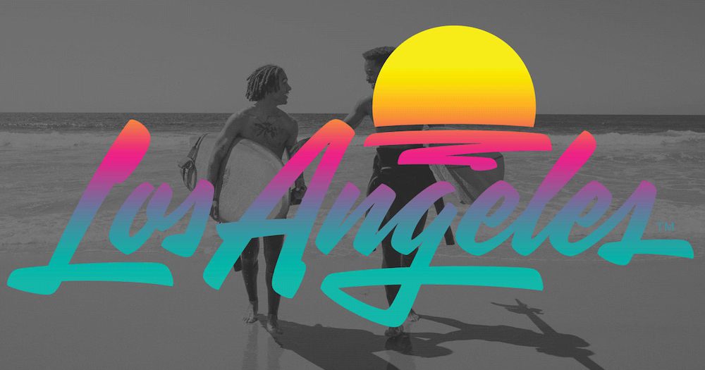
Say hello to the fresh logo, iconography, and colours of the Los Angeles Tourism & Convention board.
Created through a first-time partnership between Studio Number One (SNO) and House Industries, the new logo is said to “embrace the optimistic spirit of Angelenos, while inviting visitors to discover a destination that celebrates personal freedom under a sun of infinite possibilities.”
Errrm yes, please. Who doesn’t want more of that in their lives right now?
The board says the sun motif is a highly recognisable symbol that reinforces the equity that Los Angeles owns in breathtaking sunsets. Anything under the sun can happen in Los Angeles.
The dome shape of the sun was also inspired by L.A.’s iconic architecture such as the Hollywood Bowl, the Cinerama Dome, the Griffith Observatory, and the orchestra pit at Walt Disney Concert Hall.
Apparently, the artistic brush stroke under the sun abstractly represents the ocean, creativity and self-expression to underscore that “everyone is welcome here”.
“When you say ‘Los Angeles’ it doesn’t necessarily mean just a city. It’s a whole mindset, a vibe, a culture, and as an Angeleno, it was exciting to me to take on the creative challenge of designing a mark representing all the things that Los Angeles means to people,” said Shepard Fairey, owner of Studio Number One.
“On that creative path, I worked with my team at Studio Number One, and the inspiring cool factory that is House Industries, led by my friend Andy Cruz. We all dug deep into L.A. culture and came up with a great answer that we feel embraces the spirit and optimism of L.A.”
The new branding makes its debut as L.A. continues its comeback, fully reopening museums, indoor dining, theme parks and outdoor live events including spectator sports, and Los Angeles Tourism continues to invite visitors to start their comeback.
What do you think of the new logo? Do you love the fresh 80’s revamp or think it should have been left behind with tight perms and bright leotards?


